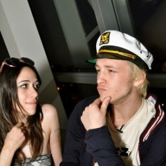
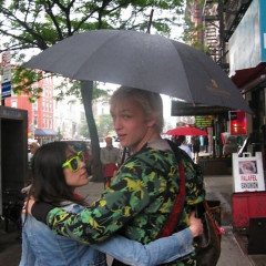
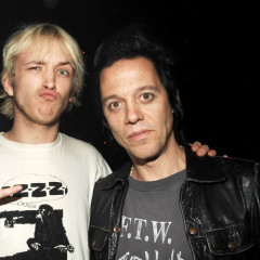
 It's been almost a year since Aesha Waks and Liam McMullan announced their engagement at our Yacht Rock Party. We haven't seen their Engagement Announcement in the Times yet, though, and we think it's probably because they can't decide on the perfect engagement picture to include with it. That's where we come in!-
-
-
-
We've rounded up a selection of photos of the enigmatic couple (it wasn't hard--these two manage to be constantly in front of a camera). Which of these do you think they should use for their announcement?
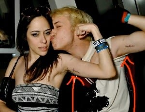
Option 1: The Gun Show
Pros: They don't have flabby arms. Their tattoos are a visual representation of their permanent devotion.
Cons: Might be a little too much armpit in this picture. And we're not sure we love Liam's Man-tank.
-
-
-
-
-
Option 2: The Au Naturel
 Pros: It's artsy! Liam's hair looks good. That wallpaper will appeal to New York Times readers.
Cons: Prominent ribcage and lack of clothing might be distracting?
-
-
-
-
-
-
-
-
Option 3: The Film Noir
 Pros: Aesha looks sexy. That is pretty lipstick. The background of 15th Century hymnals might appeal to New York Times readers.
Cons: We can't see Liam.
-
-
-
-
Option 4:The Casual Backstage Snapshot
Pros: They look cute and couple-y. The backstage setting reflects her interests (acting.)
Cons: Liam sort of looks like a zombie.
-
-
-
-
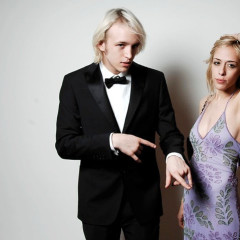
Option 4: Their ACTUAL engagement pictures
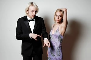 Pros: More clothing than we're used to seeing them in. Liam looks good in a tux. Plain grey backdrop might appeal to New York Times Readers.
Cons: They don't look especially interested in each other...maybe still too much armpit.


.jpg)
.jpg)

.jpg)
.jpg)
.jpg)
